
Young Epilepsy and St Piers – Brand Refresh
A brand refresh for two organisations
One brand family, one clear voice: two distinct identities, built on a defined purpose.
The brief
Young Epilepsy and its sister organisation, St Piers School, needed a brand that explained why they exist, not just what they do. We gave each a clear, confident identity, distinct from the other but recognisably part of the same family.
Young Epilepsy had no formal brand strategy and no consistent way of presenting itself. Messages varied from one audience to the next, and the brand said more about what the charity does than why it exists. The task was to define the brand, then express it in words, pictures and design, keeping Young Epilepsy and St Piers distinct but part of one family.
The idea
A purpose for each
Young Epilepsy’s purpose is to inform, educate, inspire and engage the nation through young people with epilepsy living ambitious and fulfilled lives. St Piers has a different purpose: to create an environment of growth, where young people can thrive and become a valued part of their community.
From those purposes came a brand idea for each. For Young Epilepsy: together we create possible. For St Piers: grow, nurture, thrive.
Two voices, one brand
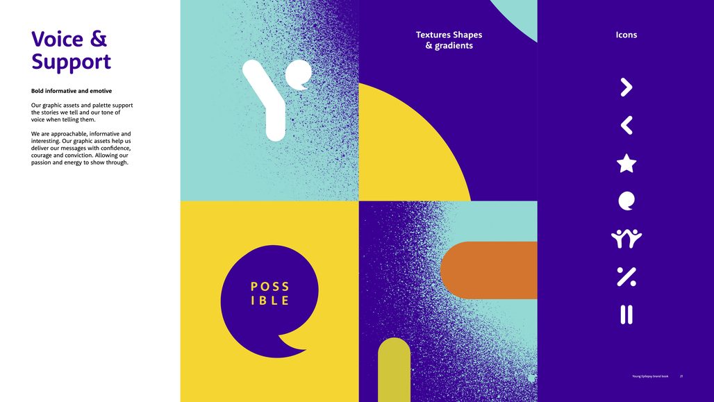
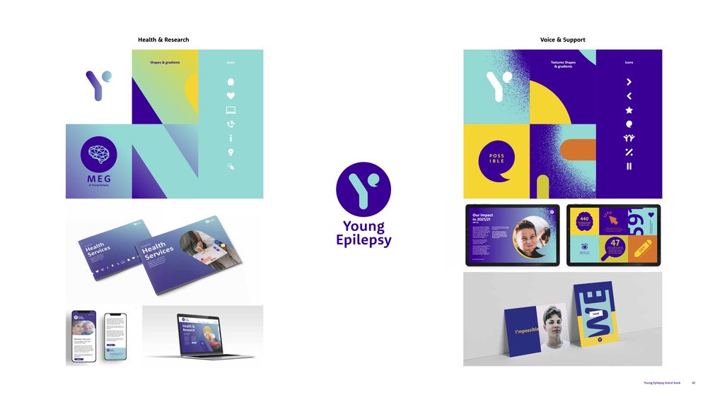
Young Epilepsy’s brand has two parts. Health and Research covers science, clinical services and diagnosis. Voice and Support covers resources, support services and campaigning, amplifying the voices of children and young people with epilepsy. The two share a logo and typeface, while photography, palette and tone flex to suit two different audiences.
The work
How we got there
We began with two immersion sessions, one for Young Epilepsy and one for St Piers, bringing key stakeholders together to explore why each organisation exists. We then interviewed audiences from both, from young people and parents to schools, employers and the organisations’ own people, and ran brand archetype workshops with the Young Reps and with St Piers. The research and strategy were presented to the trustees.
A logo that works harder
Both logos are built from an icon and a wordmark, so the icon can stand alone as a favicon, a pattern or a graphic device.
In the Young Epilepsy logo, the letter Y stands for young people. Inside it, an e for epilepsy forms a speech bubble, the heart of the brand, representing young people’s voices.
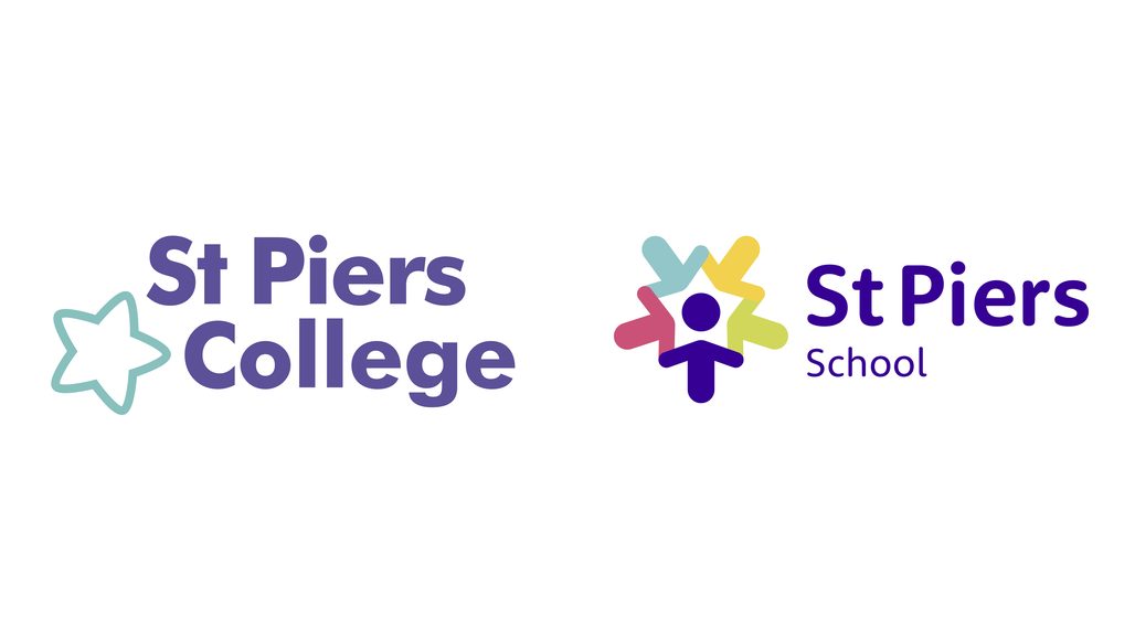
In the St Piers logo, a purple figure at the centre represents a student, with the specialisms of the multidisciplinary team on each side: education, therapy, medical and caring. Their bodies form four coloured arrows, for positivity and progress. St Piers also has a master brand and a family of logos for the institutions within it, so each part of the school feels connected.
Colour, shape and texture
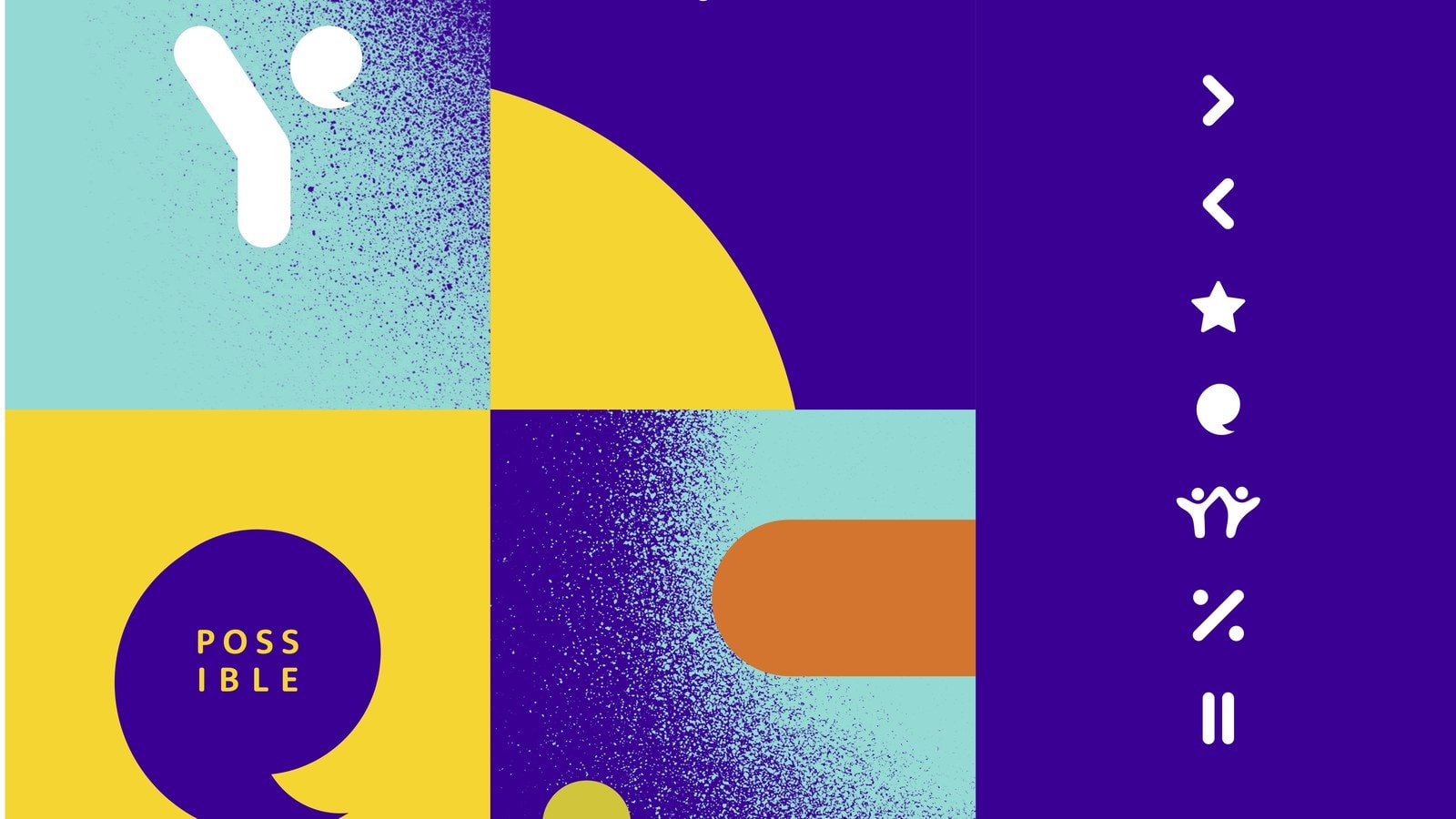
Bold, simple palettes. Young Epilepsy has two, one for each side of the brand. St Piers has six colours, led by purple, pink and blue, with yellow and green used more sparingly. The graphic assets grow from the logos themselves: for St Piers, the lozenge and circle are the building blocks for every shape and icon, from the simplest to the repeating and animated. Type is Rooney Sans for headlines and copy, with Market Pro as a playful highlight font for younger audiences.
The brand in action
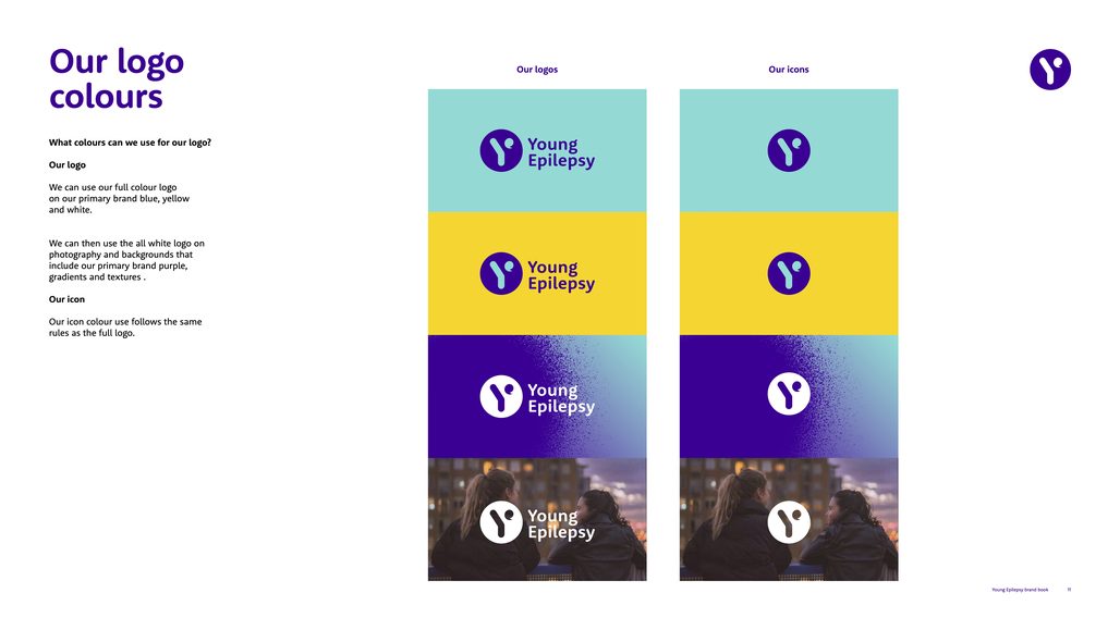
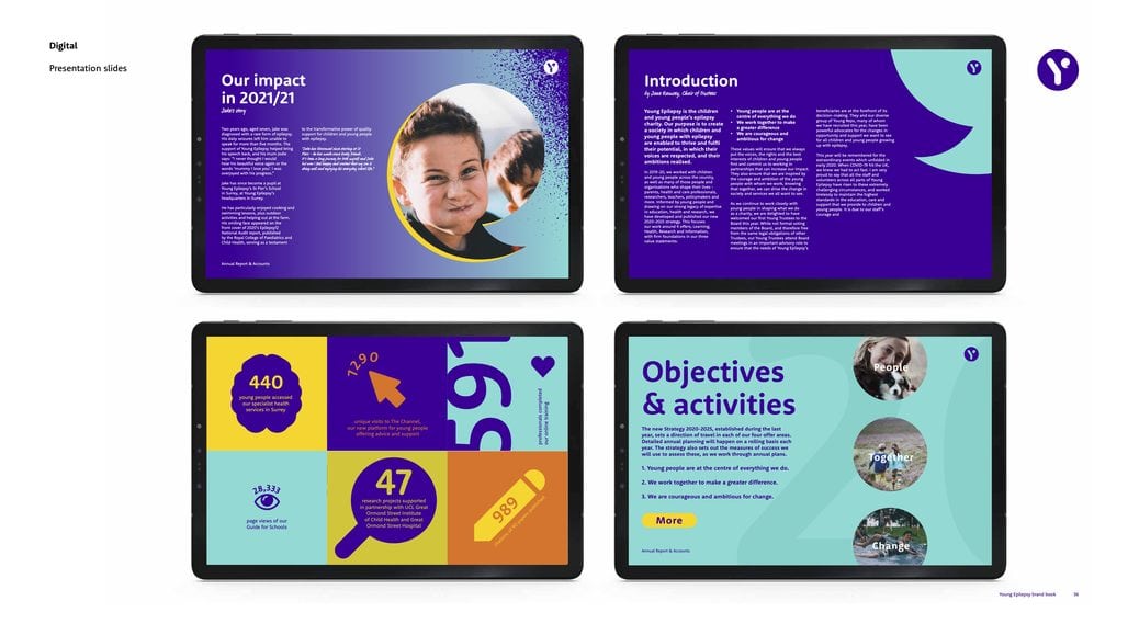
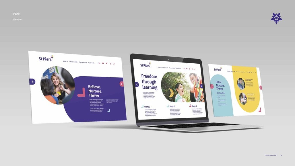
Brand books for both organisations set out the rules and show the system at work, from digital reports on tablets to websites, stationery and social.
Alongside the brand books, we developed tone of voice guidelines for both organisations, built PowerPoint and Word templates for Young Epilepsy, St Piers, the School and the College, and drew up website wireframes.
The results
Both brands have launched. Young Epilepsy used the work to redefine its core offers as Specialist Education, Health and Research, and Voice and Support, and now has a complete identity system to roll out in phases across its websites, reports, stationery and social channels.
Client testimonial
“With the support of a small but mighty brand agency, Young Epilepsy staff carried out the audience research while reshaping our marketing plans for the year so we could refresh both brands…” Young Epilepsy Annual Report
“We now have a compelling brand identity to support that ambition.” Chief Executive’s review, Young Epilepsy Annual Report
Blonde’s role
Brand strategy, visual identity and brand books.
Credits
Client: Young Epilepsy and St Piers School
Brand strategy, identity and brand books: Blonde


